Website Content Types
Mines Design System
The Mines Design System (Content Types) provides screenshots, descriptions and recommended use cases for each content type available in the Terminalfour Content Management System (CMS).
Accordion
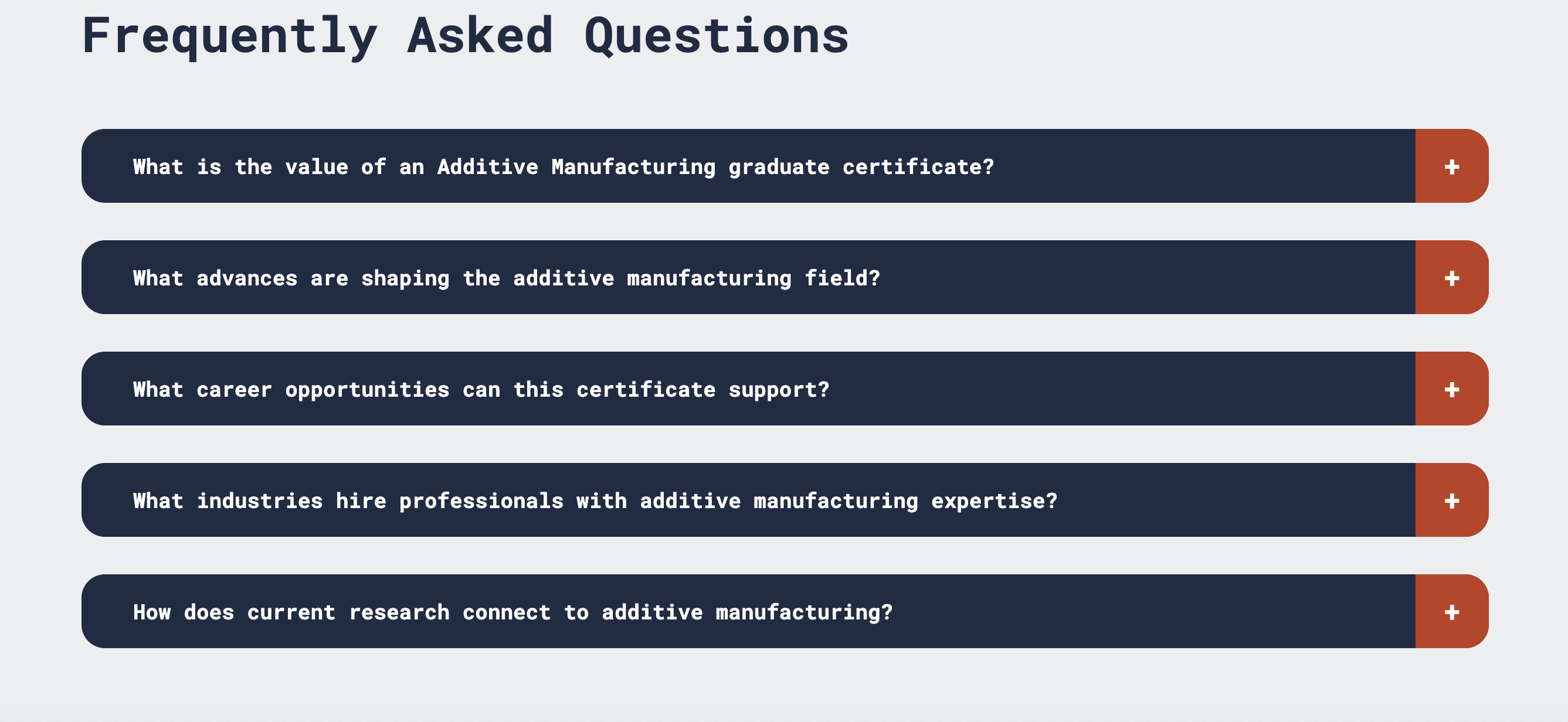
Displays dropdown accordion panels. Each accordion can contain a heading and expandable content.
Alternating Image and Text
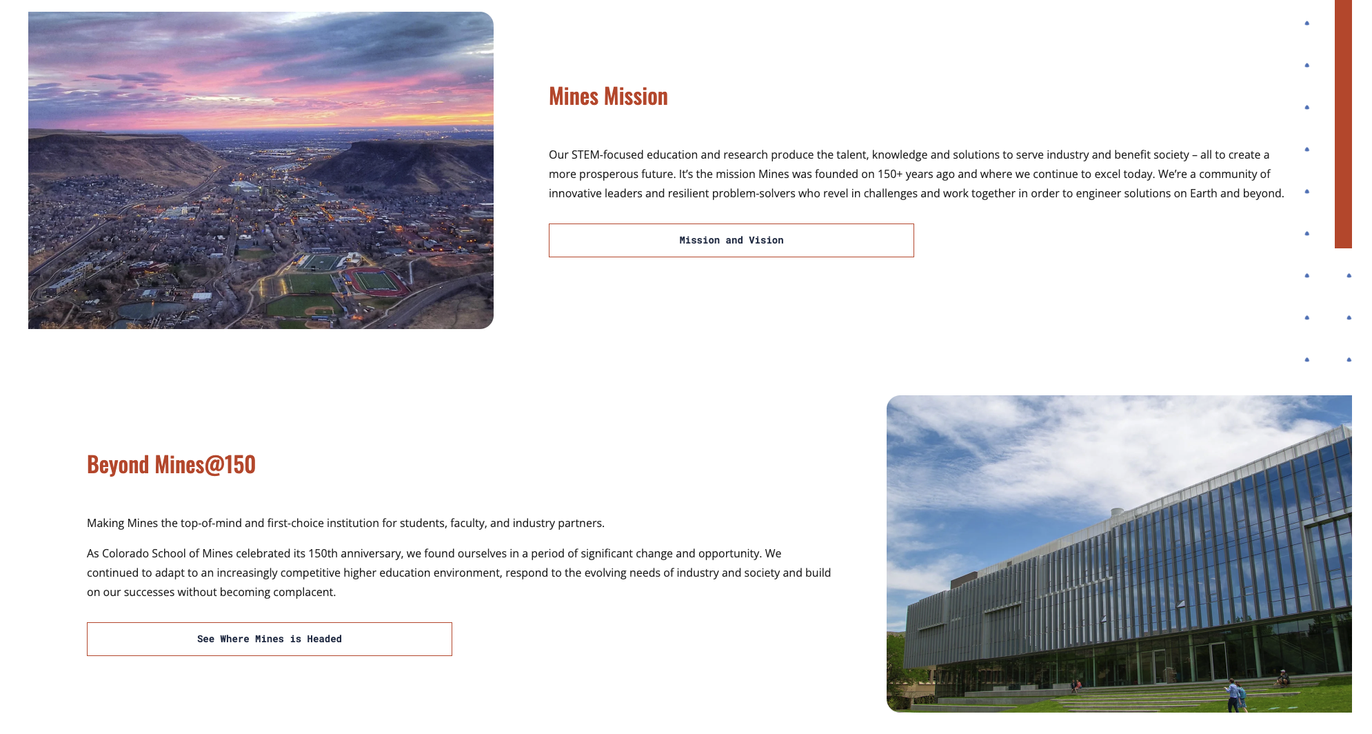
Displays alternating content sections, with each section automatically alternating between left and right alignment.
Learn More About Alternating Image and Text
Announcement
The Announcement component displays a full-width banner directly below the main navigation and above the page hero image. It is ideal for highlighting important announcements, alerts, deadlines or other time-sensitive information that should be prominently displayed at the top of the page.
Learn More About Announcements

Blog/Announcements
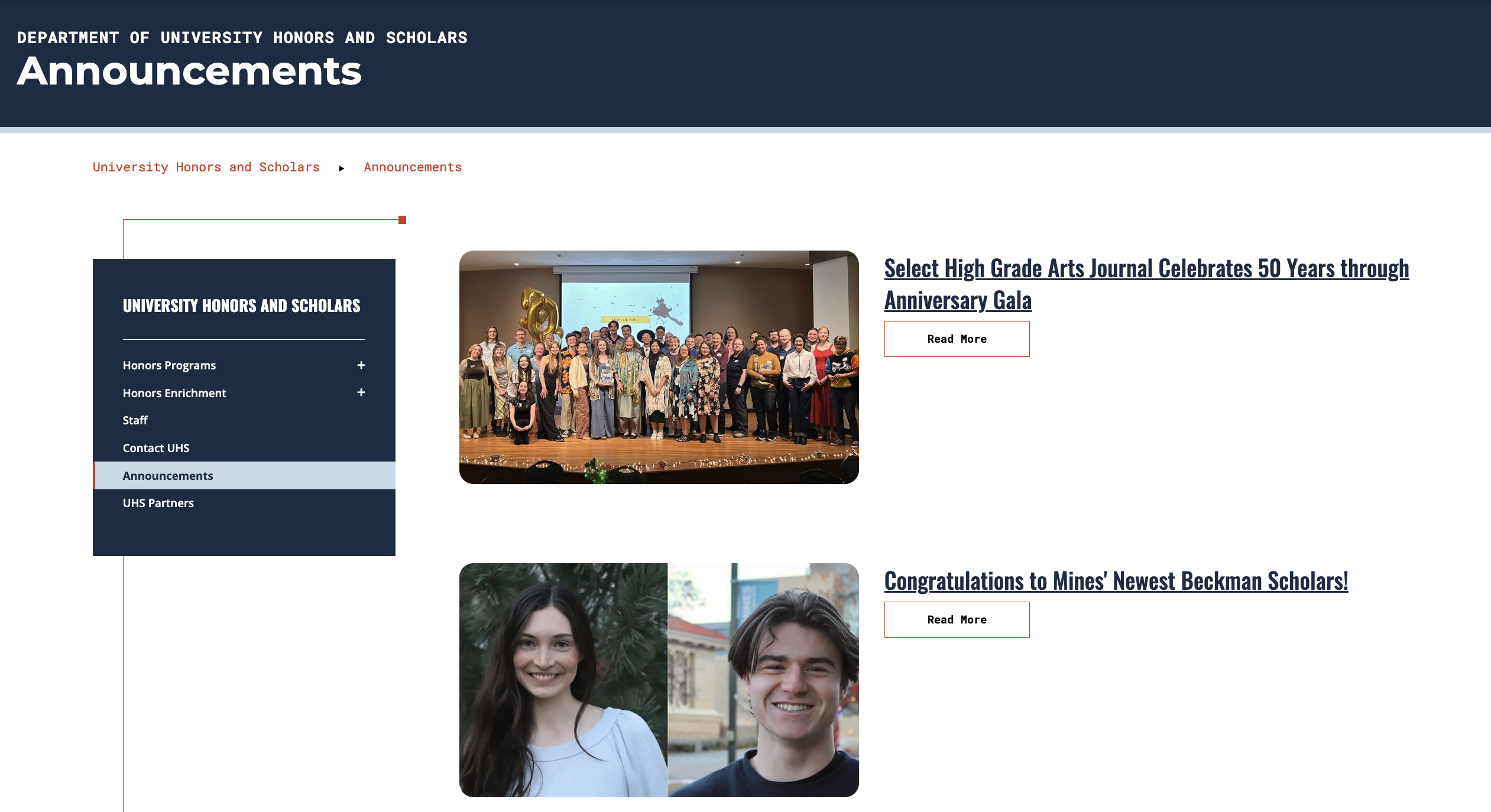
The Blog section is intended for departments to share updates, announcements and other department-specific information. Departments should not republish news articles that have already been published in the official Mines Newsroom. If you would like to display official newsroom stories on your site, the web team can provide a department-specific news feed upon request.
Learn More About Blog/Announcements
Buttons
Buttons can be added to many content types to help guide users to important pages, resources or actions. Use buttons to highlight the most important next steps and improve navigation.
Calendar
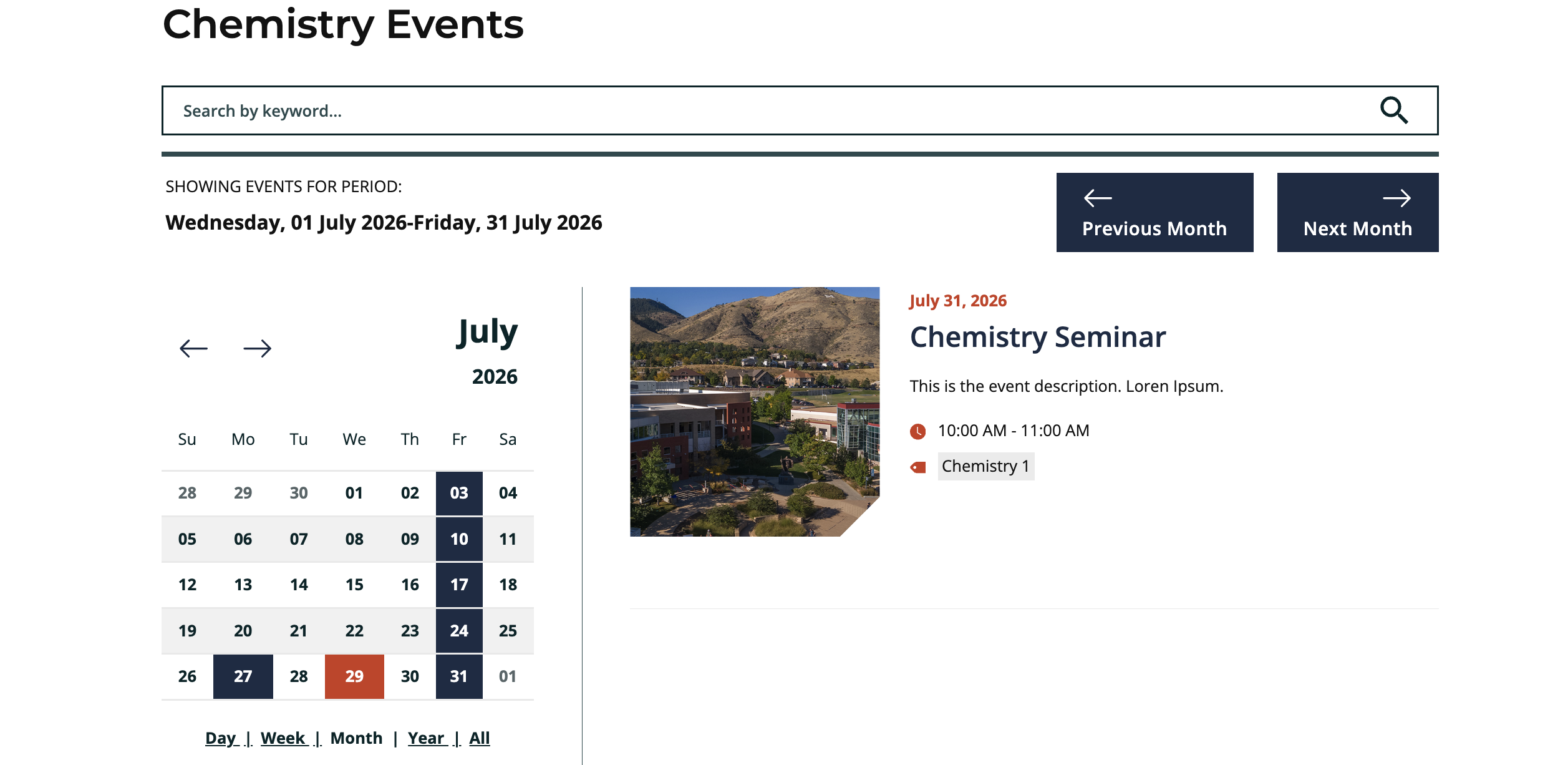
Any department may request a calendar to display department events, seminars, speakers and other related activities. Calendars must be requested through the Office of Communications and Marketing. webteam@mines.edu
Callout
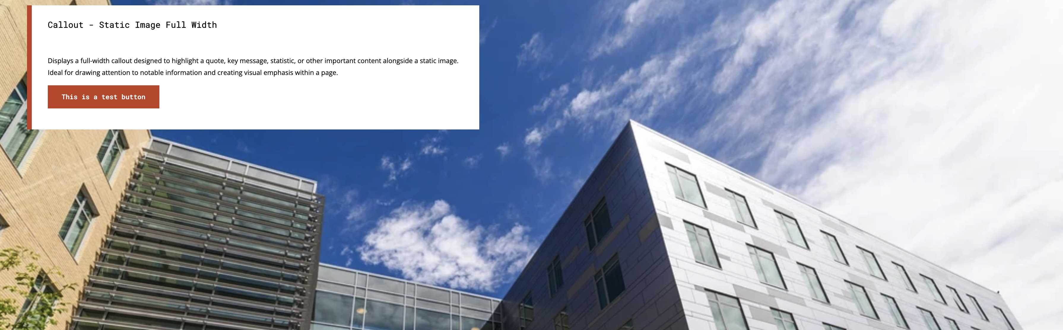
Displays a callout designed to highlight a quote, key message, statistic or other important content. Full width, content width and carousel options are available.
Call-To-Action Row
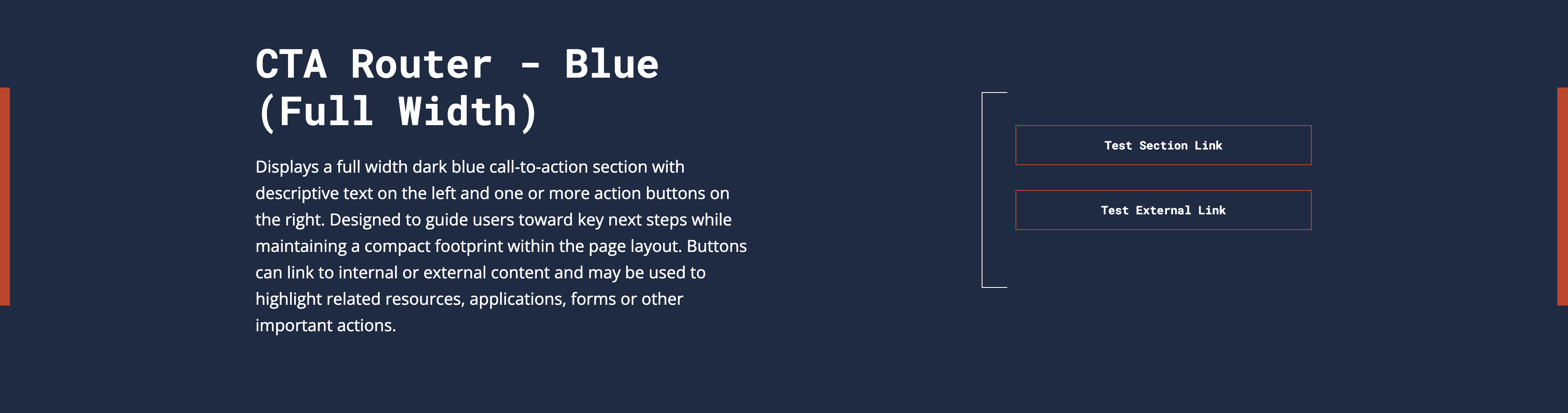
Displays a call-to-action section with descriptive text on the left and one or more action buttons on the right. Available in blue or white backgrounds.
Learn More About Call-to-Action Rows
Code Block
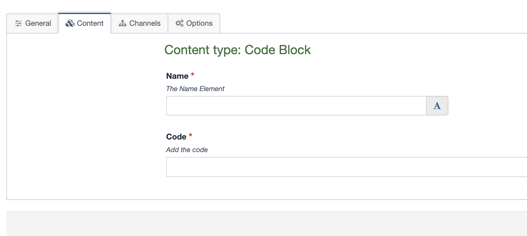
The Code Block content type allows you to add custom embed code or scripts from third-party services. Use this content type only when a standard content type is not available, and ensure any embedded content meets accessibility and security requirements.
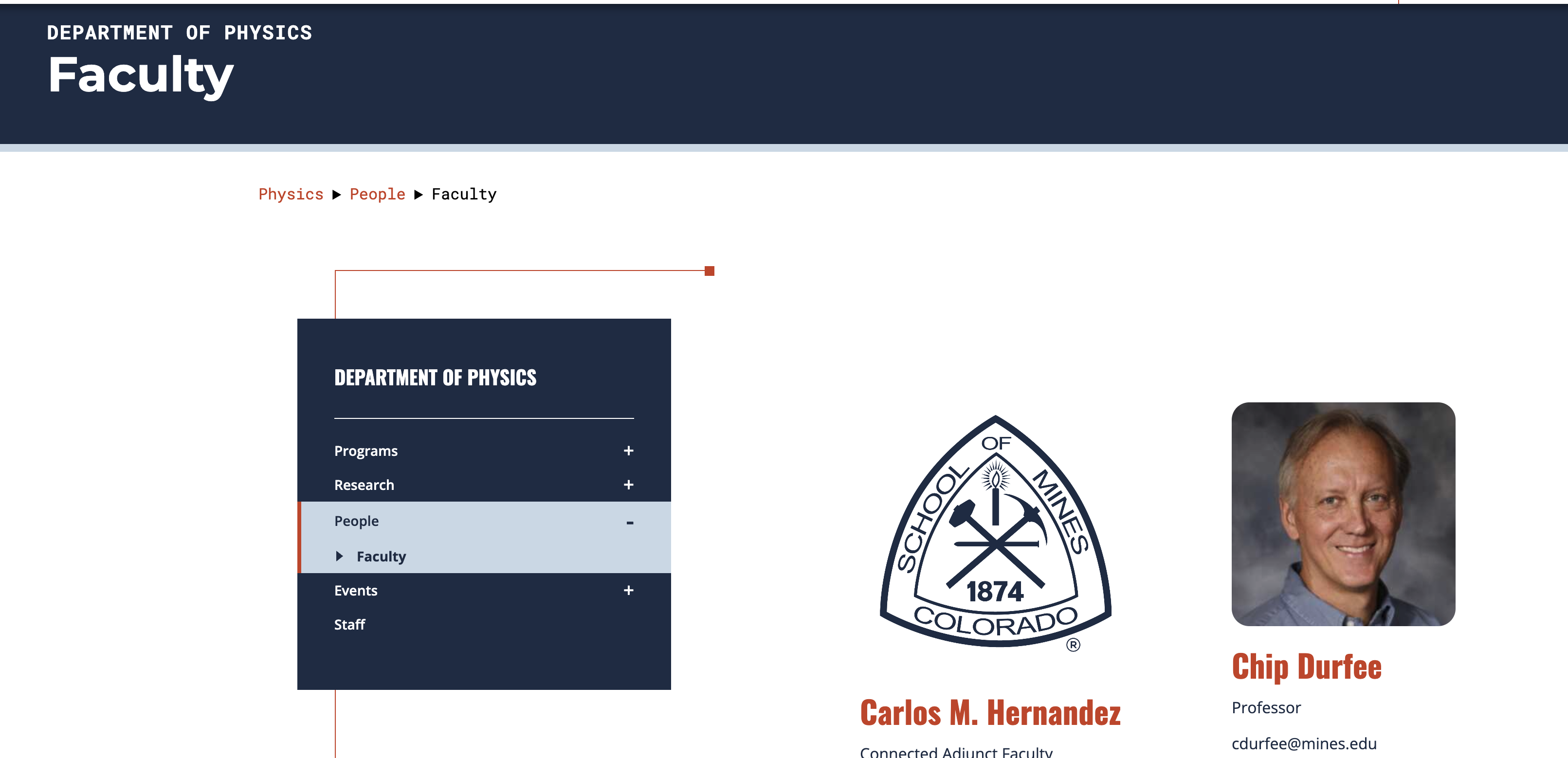
Department Faculty Listing
Lists faculty as a feed from the Faculty Directory for a specific department. This component must be requested through the Office of Communications and Marketing. webteam@mines.edu
Learn More About the Department Faculty Listing
Feature Row
A feature row is a full-width visual component displayed anywhere inside the page body below a header. Available options include white, Mines blue or a topography pattern.

Header
The Main Header content type is used at the top of every page and should be included on all pages within your website. It displays the page title and can be used with or without an image.

Highlights Cards
Displays highlight cards that are available in multiple configurations. Links can be added to a section, content or external. Content may be added with or without images. Links are optional.
Learn More About Highlights Cards
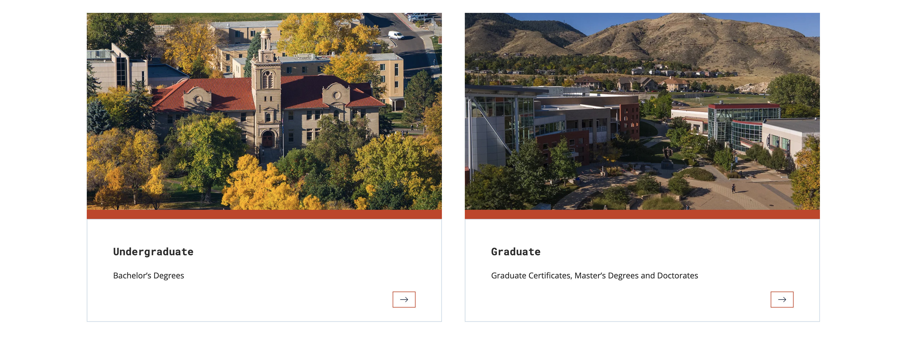
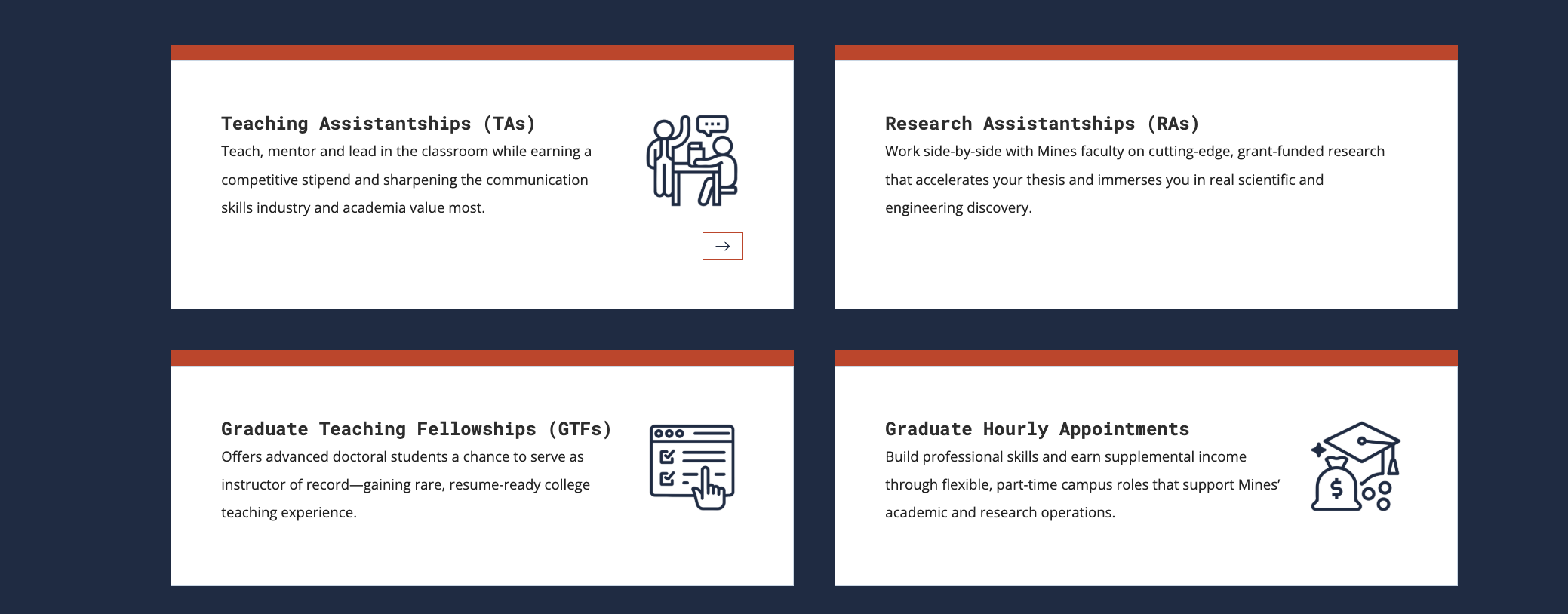
Image Gallery
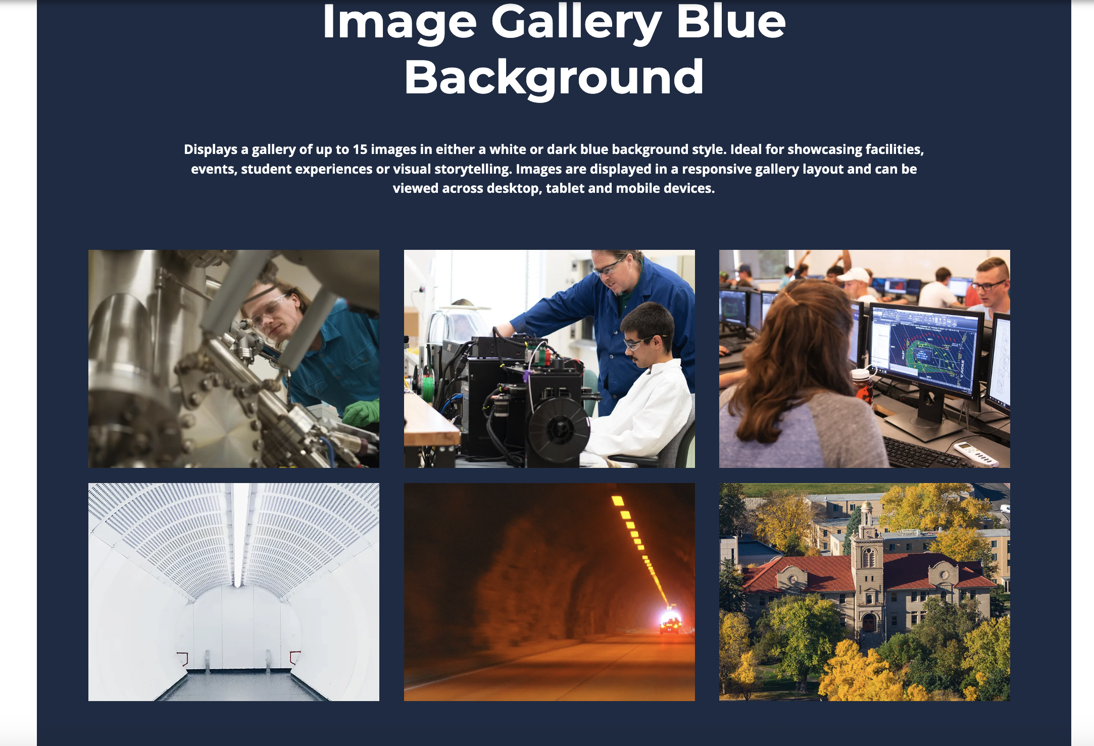
Displays a gallery of up to 15 images in either a white or dark blue background style.
Learn More About Image Galleries
List
Displays a list of items that can be presented in either a boxed style with a Colorado Red border or an unboxed layout.
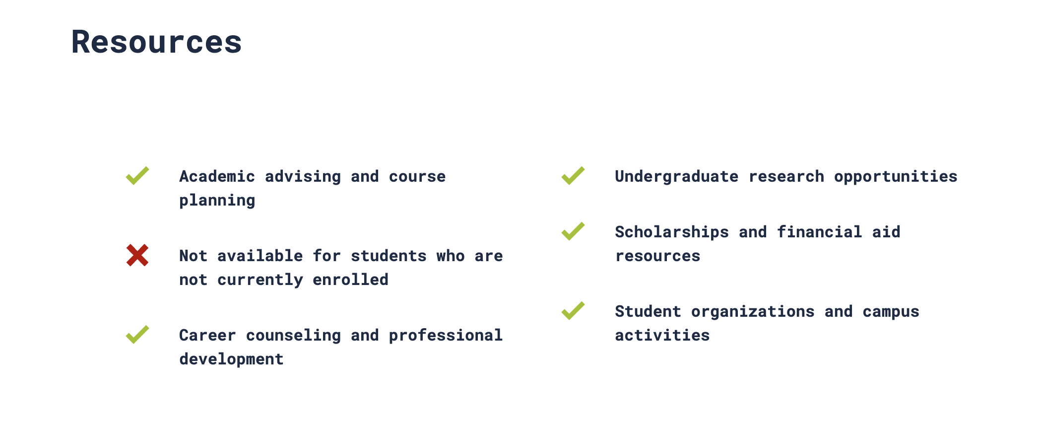
Logo Grid and Carousel
Showcases logos that link to internal pages or external websites. Choose between a responsive grid with up to four logos per row on desktop or a rotating carousel. Ideal for highlighting partners, sponsors, accreditations, memberships or affiliated organizations.
Learn More About Logo Grid and Carousel
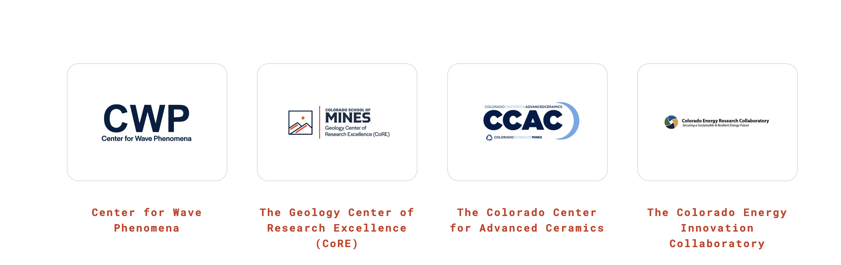
News
Displays the three most recent news stories from the official Mines Newsroom that are related to a department. A department-specific news feed must be requested through the Office of Communications and Marketing at webteam@mines.edu.
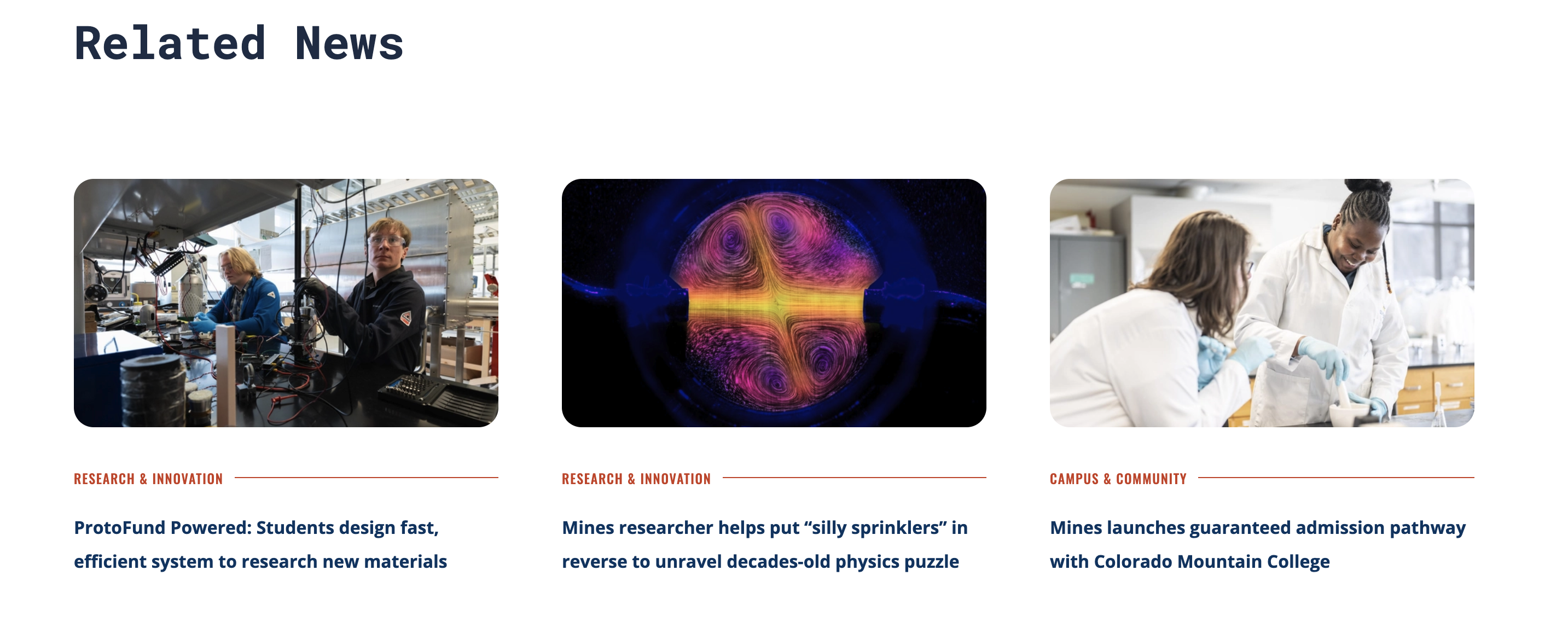
Photo Grid
A Photo Grid displays up to 11 images in a visually engaging grid with a mix of large and small image sizes to create visual interest.

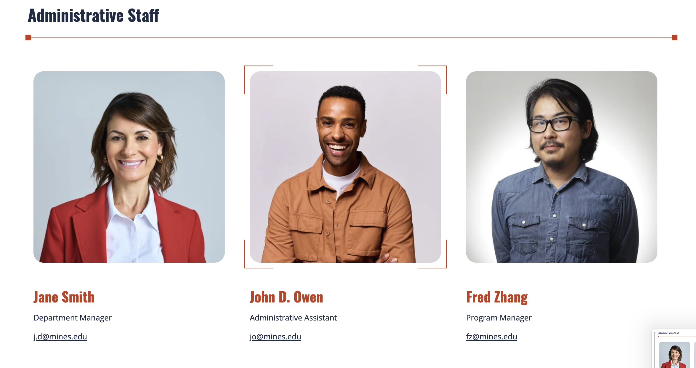
Staff Group
A Staff Entry displays an individual with a headshot, name, title, contact information and an optional biography. It can also be used by departments to list emeriti, fellows or other faculty not included in the faculty directory.
Stats
Display statistics in a vertical list without images, or in a responsive grid with or without images. Ideal for highlighting achievements, rankings, key metrics or quick facts.
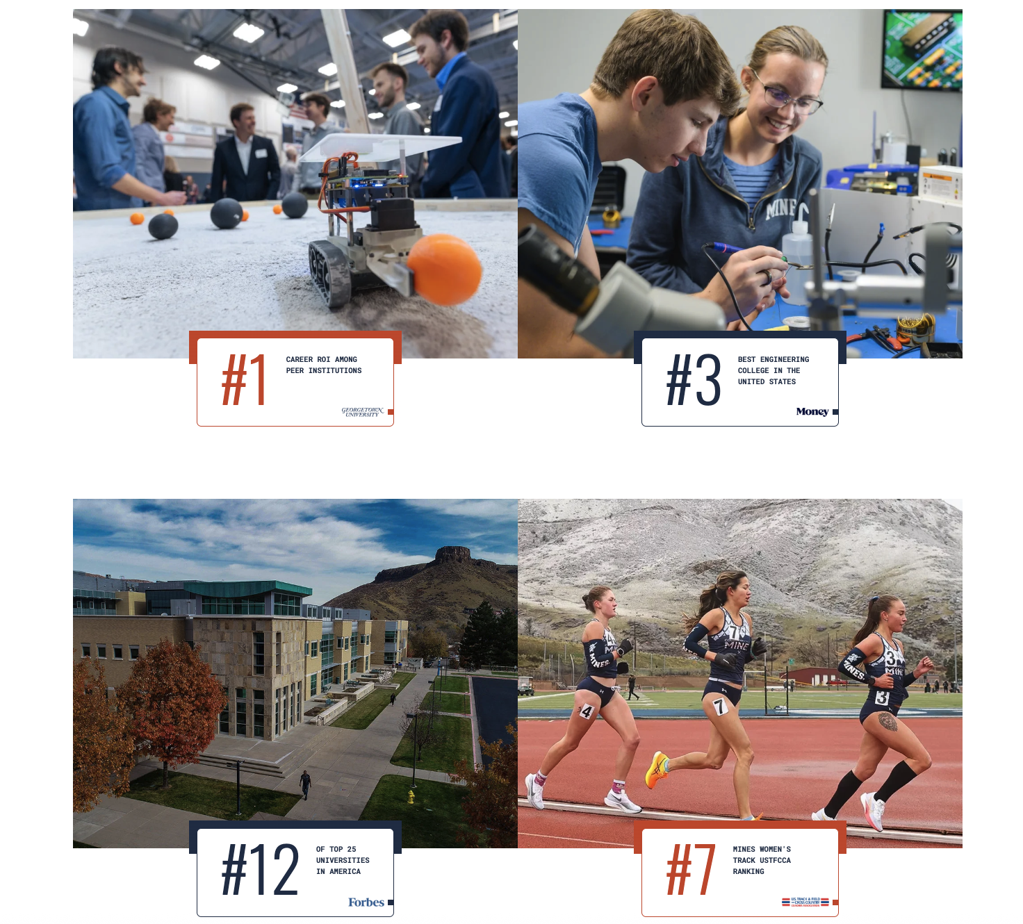
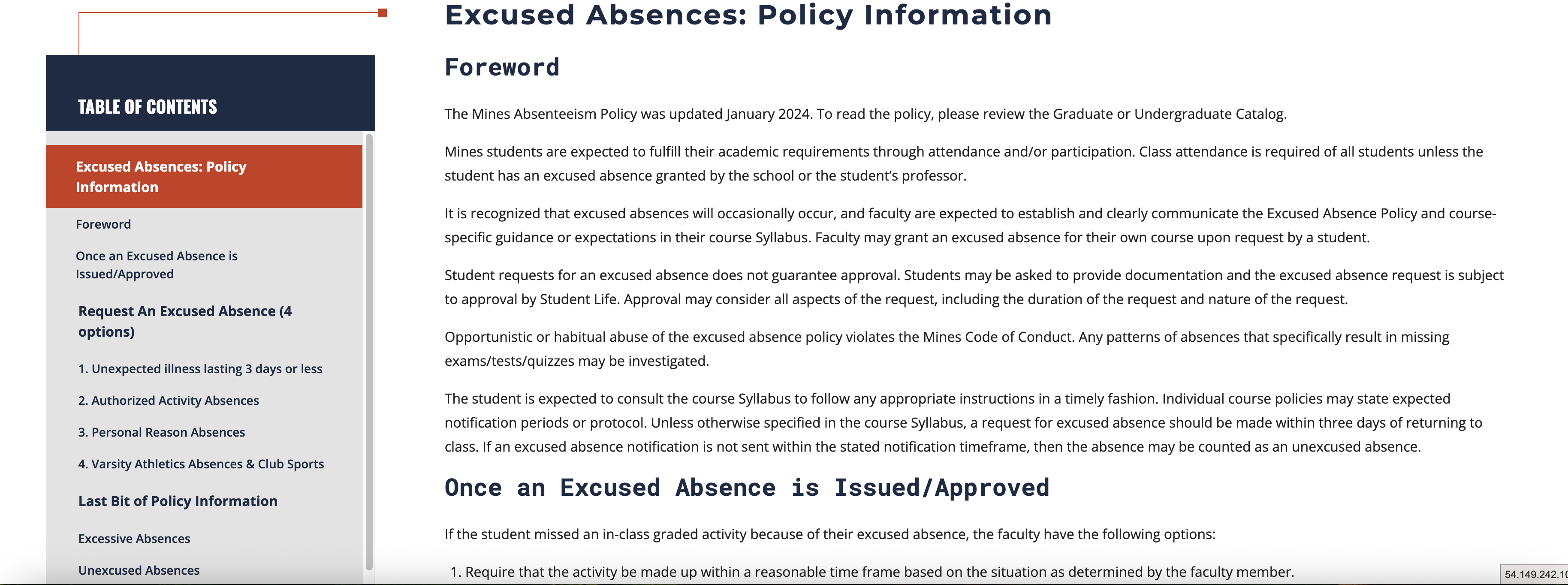
Table of Contents
Table of Contents automatically generates a side navigation menu based on the headings (H2–H4) used on the page.
Learn More About Table of Contents
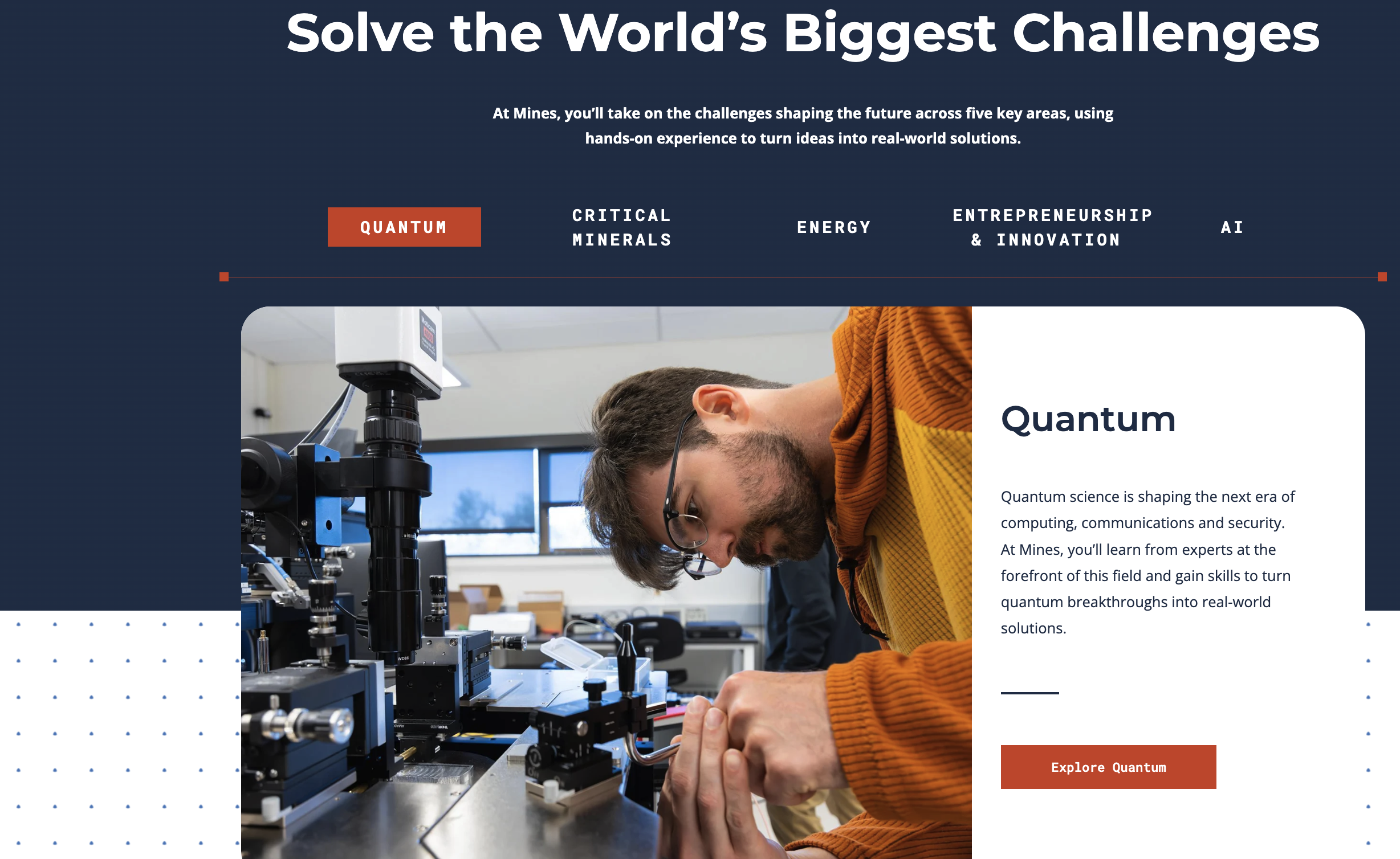
Tabs
Three tab styles are available: Horizontal Tabs with Images for visual content with optional buttons, Vertical Tabs for organizing larger amounts of information and Text-Only Tabs for presenting related content in a simple, compact format.
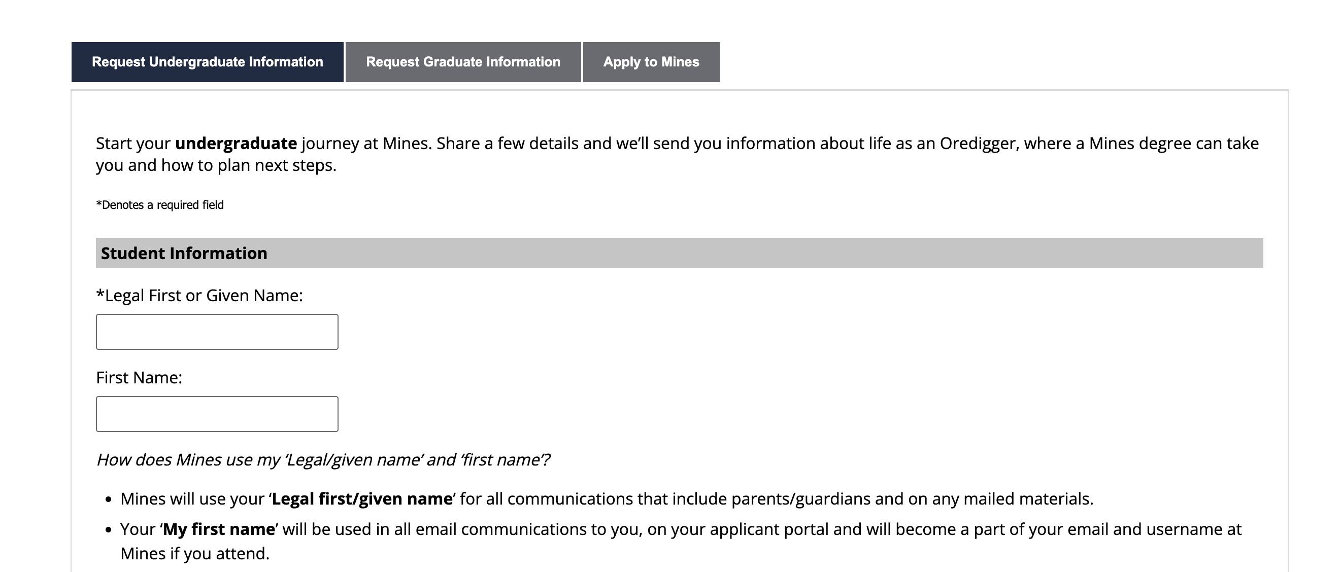
Tabs Simple (Text Only)
Displays content organized into simple horizontal tabs without images or icons. Use this content type to group related information into text-heavy sections.
Testimonials (Quotes & Spotlights)
Quotes and Spotlights highlight testimonials, featured people or key messages as either a single item or a carousel.
Text Block
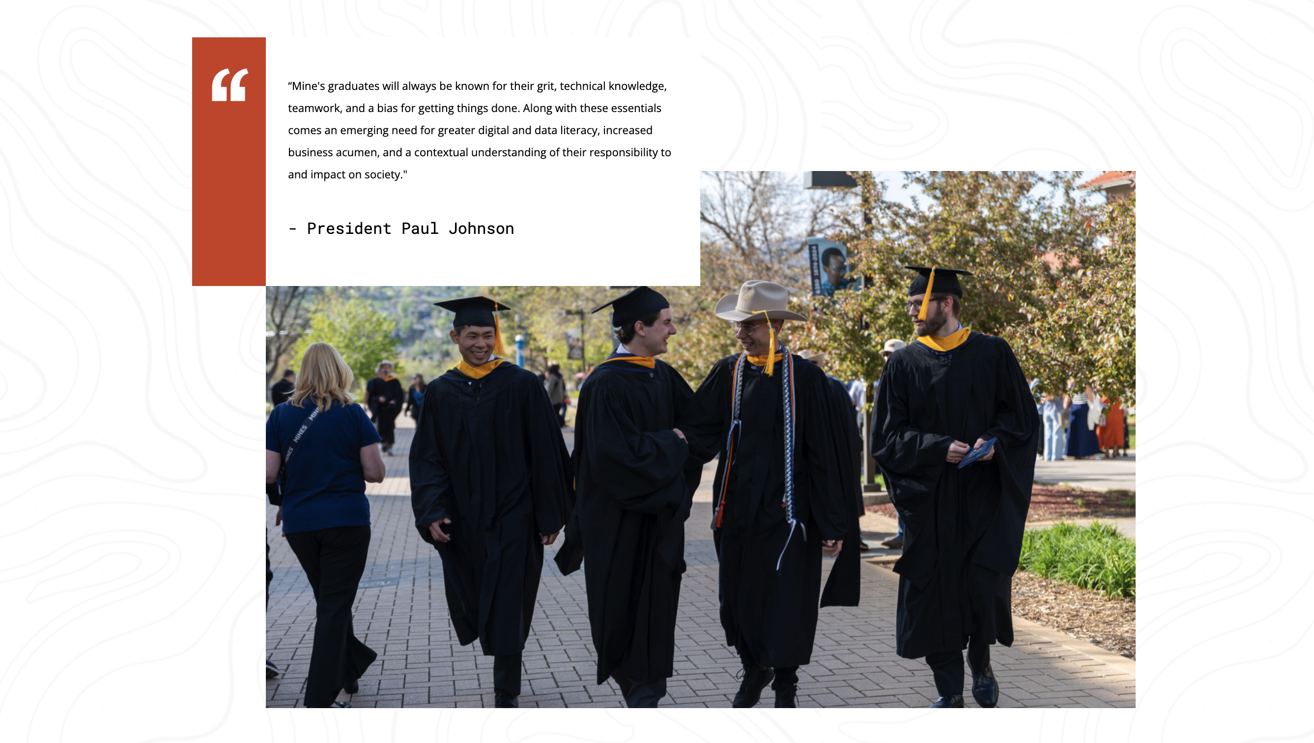
The Text Block (HTML) Editor provides a flexible content area for adding and formatting text, images, links and other general page content.
Text Block with Background Color
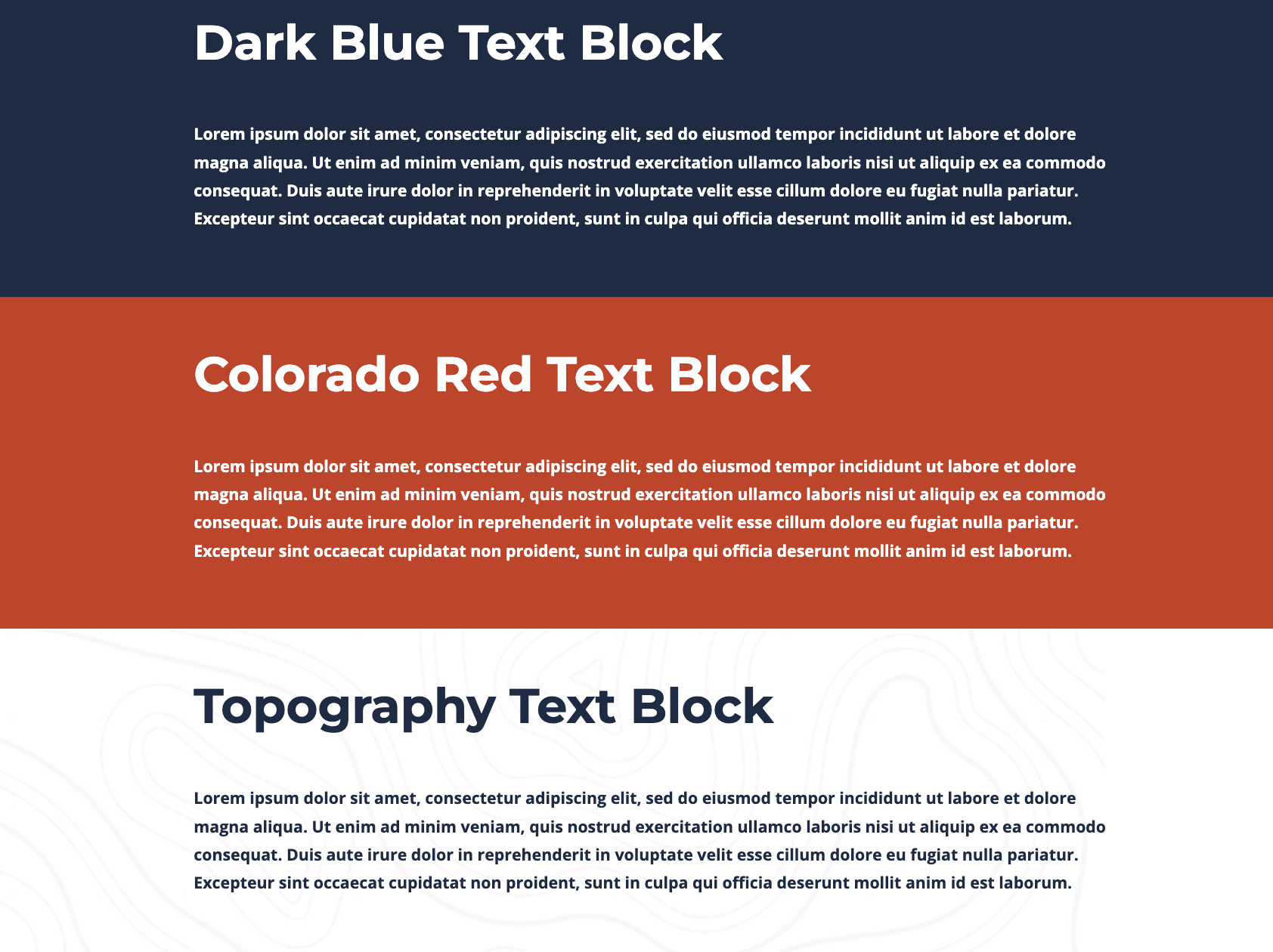
This Text Block provides a content block with bold text to be used as a way to feature content in your page body and the ability to choose from several background colors.
View Text Block with Background Color Examples
Two and Three Column Text Block
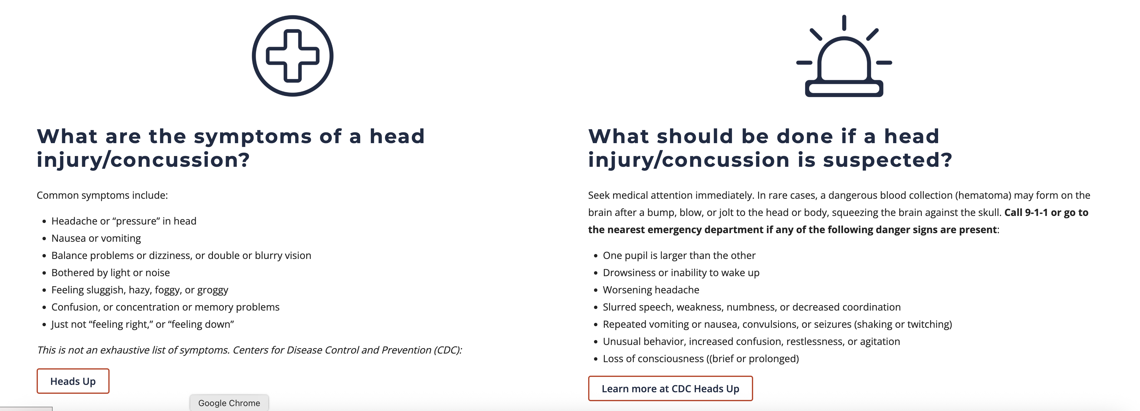
Two- and three-column text blocks organize content into two or three equal-width columns. Each column includes an HTML editor, allowing you to add formatted text, images, embedded videos and other HTML content. Background color options include White, Gray, Colorado Red and Blue Dark. On smaller screens, the columns stack vertically for readability.
Videos
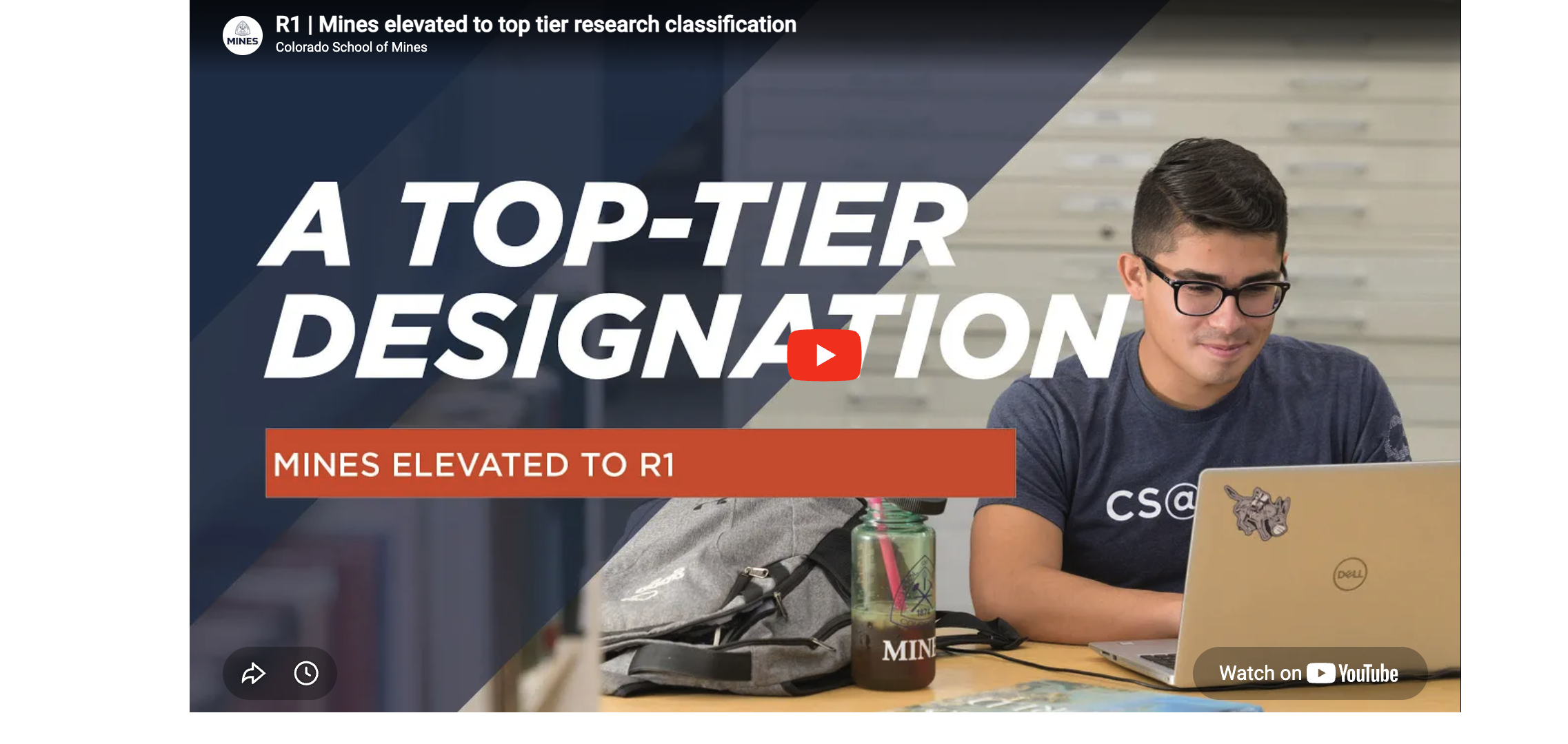
Videos support both YouTube and Kaltura videos, available as a single video, a video carousel or a YouTube Shorts carousel for showcasing multiple short-form videos.